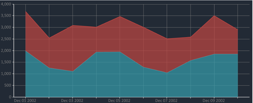
Stacked Area Chart [Deprecated]
Stacked area chart is useful in visualizing changes of part to a whole relationships over a period of time. With stacked area chart, data is represented as a double layered area.
How to display scatter chart using Bunifu Dataviz
private void render()
{

    var canvas = new Bunifu.Dataviz.WinForms.BunifuDatavizAdvanced.Canvas();
    var datapoint = new Bunifu.Dataviz.WinForms.BunifuDatavizAdvanced.DataPoint(Bunifu.Dataviz.WinForms.BunifuDatavizAdvanced._type.Bunifu_stackedArea);

    datapoint.addxy("new Date (2002,11,10)", new JArray(16.23, 17.99).ToString());
    datapoint.addxy("new Date (2002, 11, 9)", new JArray(15.95, 19.25).ToString());
    datapoint.addxy("new Date (2002, 11, 8)", new JArray(11.30, 16.88).ToString());
    datapoint.addxy("new Date (2002, 11, 7)", new JArray(13.29, 14.28).ToString());
    datapoint.addxy("new Date (2002, 11, 6)", new JArray(15.23, 16.45).ToString());
    datapoint.addxy("new Date (2002, 11, 5)", new JArray(13.70, 16.50).ToString());
    datapoint.addxy("new Date (2002, 11, 4)", new JArray(17.50, 19.00).ToString());
    datapoint.addxy("new Date (2002, 11, 3)", new JArray(19.50, 20.85).ToString());
    datapoint.addxy("new Date (2002, 11, 2)", new JArray(20.07, 21.44).ToString());
    datapoint.addxy("new Date (2002, 11, 1)", new JArray(25.00, 26.70).ToString());

    canvas.addData(datapoint);
    bunifuDataViz1.Render(canvas);

}
Last updated
Was this helpful?